
1) My artist of choice is James White. I actually just found out about him when I recently reinstalled Google Chrome, a web browser. There is a feature on the browser that allows you to select different types of "themes" which more or less just adds a little style to the browser by adding a background image on the borders of the browser.
Examples of Google Chrome Themes:
Just google it.

Here's the gallery.

Here's a cloud example.

And here's a Mariah Carey example.

And here's the one I'm currently using (James White).

And here's even an advertisement about their themes:
Pretty nifty.
Anyway, that's where I found him.
In the bottom right corner of themes are the artist's name, so I looked him up.


And his online gallery.

To say that James White is incredibly talented at photoshop, is an understatement.


2) But now to actually select a few images of his and to analyze them:
Image 1: Network

Analysis:


Image 1: Network

Analysis:
This piece was designed as a poster for the 1976 film, Network (you can even buy it as such on his website).
Overview:
The movie is most simply about an anchorman who loses his job because his network blames him for their poor ratings. The most famous line of the movie is when the protaginist, Howard Beale, yells, "I'm mad as hell, and I can't take it anymore!". This sort of expression of anger and built-up emotion is notably seen on White's image, with a colorful explosion of the rainbow.
Denotations:
The title of the movie, and a slogan underneath.
Connotations:
The old age of the television seems to indicate that the movie was from the 70s, the choice of having a single, bland color as the background, and using a contrasting rainbow in the foreground emphasises a bland, cruel world outside of the tv world, and that the only joy and color is inside the tv(i.e. watch tv to be happy). The gold plate of the movie title and font further indicates the time period. The choice of the title being under the tv, rather than across the top of the poster, seems to indicate nothing is above the power of television. And lastly, the rainbow leaving the black and white television creates the impression that the color is leaving the tv, being sucked out of it, further proving Howard's point that:
"Everything is going crazy, so we don’t go out any more. We sit in the house, and the worid we live in gets smaller. All we say is "Please, at least leave us alone in our living rooms. Let me have my toaster and my TV and I won’t say anything. Just leave us alone." Well, I’m not going to leave you alone. I want you to get mad! I don’t want you to protest or riot. I don't want you to write to your congressman because I wouldn't know what to tell you to write. I don’t know what to do about the depressión, the inflation and the crime. All I know is that first you’ve got to get mad! You’ve gotta say "I’m a human being, goddammit! My life has value!" So... I want you to get up now. I want all of you to get up out of your chairs. I want you to get up right now and go to the window, open it and stick your head out and yell "I’m as mad as hell and I’m not going to take this any more!"
Image 2: Reckless Love

This is a CD cover for the Finnish "glam metal" band, Reckless Love. The band named themselves as such as a tribute to the band Guns and Roses. The image definitely shows the theme of a hardcore Rock n Roll type of genre.
Denotation:
The only words on the image is the name of the band, which is also the name of their third album (their most recent and most successful).
Connotation:
The font of the band's name reminds me of the band Kiss.

The end of the word "Reckless" is in the similar style of Kiss.


The end of the word "Reckless" is in the similar style of Kiss.

Also, the chrome effect of the font makes the band seem new age, ahead of it's time, brand new. Yet the use of lightning in the background is a long used symbol of rock. This combination of old and new, gives the consumer a sense of "It sounds as good as the classics, yet it's new and worth buying". The title of the band is square in the middle of the image, right in your face.
The faces of the members of the band are all looking at the viewer, with different tones and moods.
The upper left seems to be more serious, with the sides of his head hidden with his hair, as if he has something to hide.
Upper Left

The upper right has his head tilted back a bit, in a more relaxed tone and more accepting gesture. Less serious, more openness. With his tattoo showing, as if to reveal a part of who he is, unashamed.
Upper Right

The lower left is more dead on. Almost like a deer caught in headlights. He's looking right at you, eyes wide open, hair cut short. His necklace is easily seen (unlike upper right) and is another sign of "Here's a part of who I am".
Lower Left
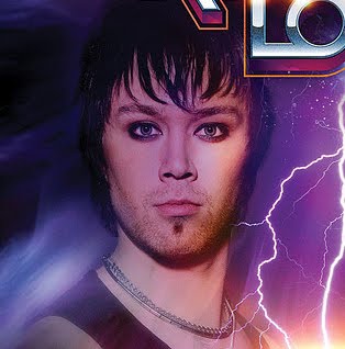
The lower right member also has his head tilted back, in a more relaxed pose. The tone though, is different. It's more of a careless, "take me for what I am, I could care less" look.
Lower Right

All these faces and implied attitudes suggest that this band is good as the old stuff, but still brand new and fresh, while at the same time hardcore and relaxed, yet intense. These are all very conflicting implications, and add to the intensity of the image. It's safe to say, there's a lot going on here.
Links & Websites Used:
James White
All I have to say is great blog! You really went over the top and put so much into this!! I love how many pictures you put and at the beginning how you actually had the google page there. Very thought out. It is nice how you also talk about a few different topics. KISS is quite the band. My father does not like them because of what their name stands for and he pretty religious, so I never really got into all that kind of music or anything, in fact I always thought they looked scary! Very intimidating!!! But people like that and all the power to them!
ReplyDeleteThis is a good blog! I found this interesting because I obviously knew about the band Kiss but never know there was a band that idolized them so much. And you can most definitely tell with the font they used that it looks like the Kiss font as well on their cover. I was going to add that the rainbow on the Network image told me that the anchorman was most happy when he escaped the "tv world"
ReplyDelete