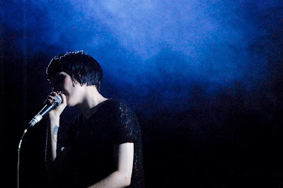
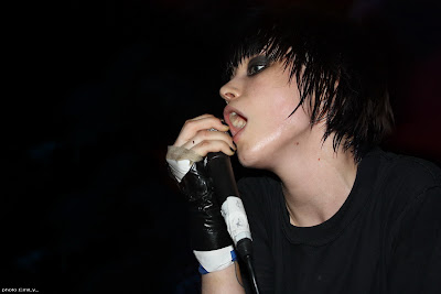
1) My first artist is Alice Glass, the lead singer for the
band Crystal Castles. I've been wanting to use her for
awhile now in a project, and now seems like the right time.
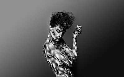
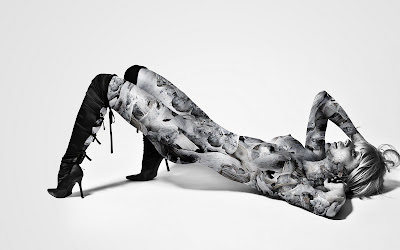
My second artist is Justin M. Maller, a "freelance
illustrator and art director based in Melbourne, Australia".
I like Justin's use of digital imagery, especially with
female figures, and Alice's unique and fierce voice in her
music is well displayed in her own look. I feel that these
two artists, one an illustrator, one a figure, can work well
together.
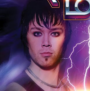
2) Alice Glass:

Justin M. Maller:

3)
ALICE:Why does this artist appeal to you?I first found out about Alice Glass by listening to a song by her band. After hearing it, I was hooked. I know own both of the bands' albums and know every song by heart. The band is comprised of a musical producer Ethan Kath (aka he makes all the crazy techno sounds) and vocalist Alice Glass. The style of the sounds mixed with Alice's voice are very appealing to me, and are what I would imagine to be the background music to a photoshop project brought to life (Tron movie, anyone?).
What are the Big Ideas in their work?A Big Idea in Alice's music is Feelings, specifically, feelings and emotions that are real or fake. In one song entitled "Xxzxcuzx Me", the last echoing lyric is "Just because we don't feel flesh, doesn't mean we don't fear death". This theme of robotic love and caring is present in many songs.
What do you find inspiring about the work?Alice is inspiring in that her music is her life. When you listen to her screaming the lyrics, you know that she is "one with the song", and that she's not just reading from a sheet. When she screams, you feel you're screaming. When the music is turned up loud, you feel it. It's inspiring how motivational and real this music sounds and feels.
What sorts of questions, curiosities, inspirations arise from your encounter with the artist's work?I question what methods are used to alter Alice's voice. In some songs, her voice is obviously manipulated, and I'm curious as to how. Much the same way I might look at a photoshopped image and wonder how it was done.
How will you use this artist to inspire your final project?I will use Alice's great presence on stage to portray her voice, and to represent the powerful potential of my own Big Idea.
What stylistic components can you learn to make your work stronger?I feel that color schemes will play a large role in my work with Alice, and that it will bring an in depth element to the image.
What approaches to making an artwork that the artist uses can help you?There's not much that Alice does that I can personally incorporate in my work. I can't sing my project to life, but I can use the visual imagery I am given and by knowing the music she is singing, I will have a great insight as to the emotion and attitude she is trying to express.
JUSTIN:Why does this artist appeal to you?This artist appeals to me in two great ways. The first, is the artists use of visual imagery to express a feeling or emotion. This is most visibly shown in the image "Vegas".

The second is the artists use of women in his work. Their bodies are used as a resource to work with. Whether it be a spine to match with the dunes in a desert, or filling the body with a complex pattern, womens' bodies are used in his work in a way that I find original and unique.
What are the Big Ideas in their work?It's hard to say what Justin's Big Idea is. In each image, it seems a different message is trying to come across to the viewer. In one image, a woman's body is filled with an image of driftwood. This has many implications, as does another image in which a woman's body is filled with a black and white pattern. All in all, complex patterns that seem to attempt to fill some kind of "void" are a reoccurring theme. And it is these patterns that add another dimension of meaning to the image.
What do you find inspiring about the work?Since Justin manipulates photos very similarly as we learn in class, I am specifically inspired when I see his work to think differently. I see these images and wonder how he went about it, and what he's trying to say in each image. Are these merely creative ideas being thrown around? Or is there something deeper?
What sorts of questions, curiosities, inpirations arise from your encounter with the artist's work?As stated above, I wonder how these images were created. Another aspect is time. How long did it take? Where these what was envisioned from the beginning, or did it evolve? Much like William Low said, in art there are times when you play it safe, and there are time when you risk it.
How will you use this artist to inspire your final project?I feel that I might be able to borrow some ideas from this artists images. Not to replicate or duplicate, but perhaps to use similar ideas to get a point across. I like the use of patterns in complex shapes (bodies), and the use of color schemes that match the background.
What stylistic components can you learn to make your work stronger?Learning to use the pattern feature will significantly help. I already know how to create a pattern of a square box with a black outline in order to create a grid that can be placed on top of other images (I learned this when trying to find out how to accurately place a virtual painting on a virtual wall using transformations).
What approaches to making an artwork that the artist uses can help you?An approach that can help me is contrast. In many images, Justin seems to cause many visuals to collide with one another. To have the background color match the main colors in a pattern, yet to have another part of the body untouched. It is these decisions that go into creating an image and a message to go with that image.


 Fail. It seems that blogger interprets the gif image as a single image, instead of a sequence of different images. Therefore, only the first image is shown.

